Dashboards are powerful tools that help professional services firms track performance, manage resources, and make smarter decisions.
By bringing all key metrics into one place, these dashboards give real-time updates on operations, finances, and client projects.
Here are two examples of exectuive dashboards tailored for CEOs/COOs and CFOs:
CEO/COO Dashboard
The CEO/COO dashboard helps leaders focus on efficiency, resource planning, and growth. It highlights how well the business is performing, tracks the profitability of projects, and monitors team capacity. With these insights, executives can make better decisions to support the company’s goals.
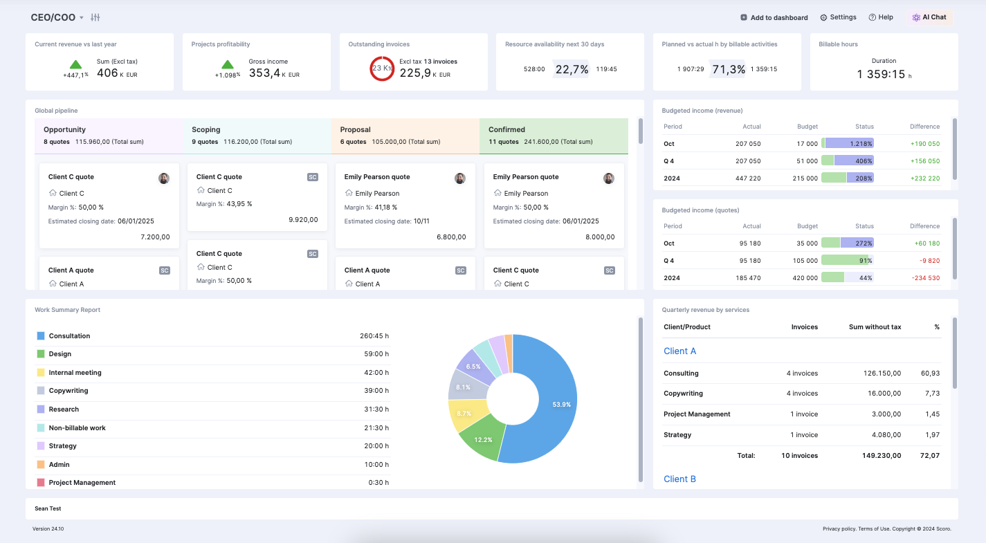
Metrics you can track include:
- Current revenue vs. last year: Compares this year’s revenue to last year’s to show overall growth
- Projects profitability: Tracks which projects are profitable and which need adjustments
- Outstanding invoices: Keeps tabs on unpaid invoices to manage cash flow
- Resource availability next 30 days: Shows how much staff time is available to plan workloads better
- Planned vs. actual by billable activities: Compares scheduled billable hours to actual hours worked to check efficiency
- Billable hours: Displays total billable hours to measure productivity and set revenue goals
- Global pipeline: Shows where potential sales are in the process, from quotes to confirmed deals
- Budgeted income (revenue): Tracks actual revenue against targets to see if financial goals are being met
- Budgeted income (quotes): Compares revenue from closed deals to expected income to monitor sales health
- Quarterly revenue by services: Breaks down revenue by service type to identify top-performing areas
- Work summary report: Visualizes how staff time is spent, identifying inefficiencies and improving planning
Trust Impact, a UK-based consultancy, used Scoro to solve challenges caused by rapid growth and a fully remote team. Scoro became their “central hub” for managing projects, tracking finances, and staying organized.
At the start of every day, I open my Scoro dashboard to check everything—costs, revenue, and performance. It’s central to what we’re doing.
CFO Dashboard
The CFO dashboard helps financial leaders focus on cash flow, budgeting, and sales performance. It brings all the important financial data together, giving a clear view of the company’s financial health and helping teams identify areas for growth or improvement.
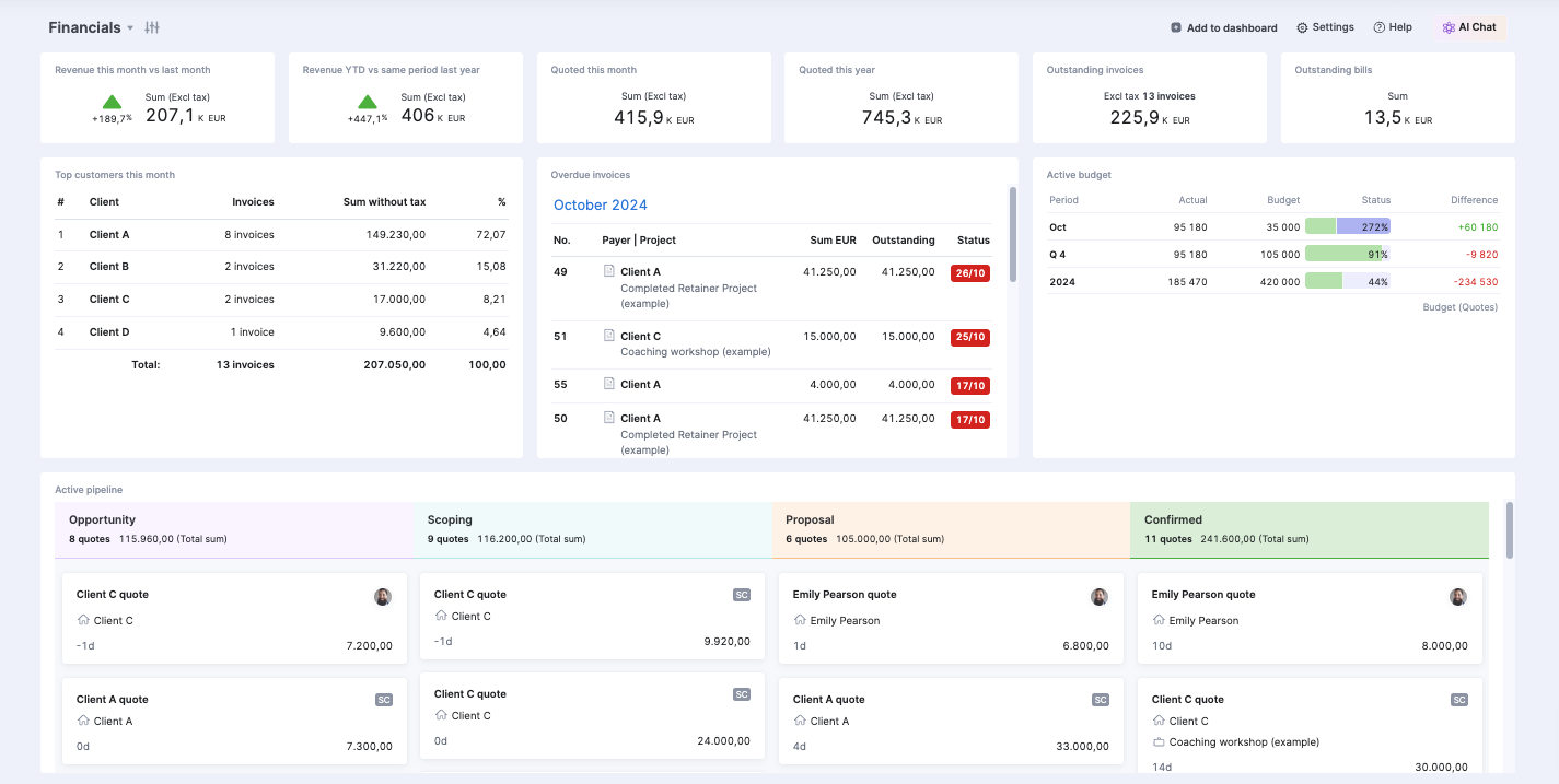
Metrics you can track include:
- Revenue this month vs. last month: Shows how revenue has changed month-over-month
- Revenue YTD vs. same period last year: Highlights long-term growth by comparing year-over-year revenue
- Quoted this month: Displays the total value of quotes sent, showing potential near-term income
- Quoted this year: Tracks the value of quotes sent for the entire year to monitor sales trends
- Outstanding invoices: Lists unpaid invoices to prioritize collections and ensure healthy cash flow
- Outstanding bills: Tracks unpaid bills to manage expenses and avoid penalties
- Top customers this month: Highlights key clients generating the most revenue
- Overdue invoices: Identifies overdue payments to help the team follow up quickly
- Active budget (quotes): Compares income from closed quotes to budget targets to track financial performance
- Active pipeline: Breaks down sales opportunities by stage to spot bottlenecks and forecast revenue
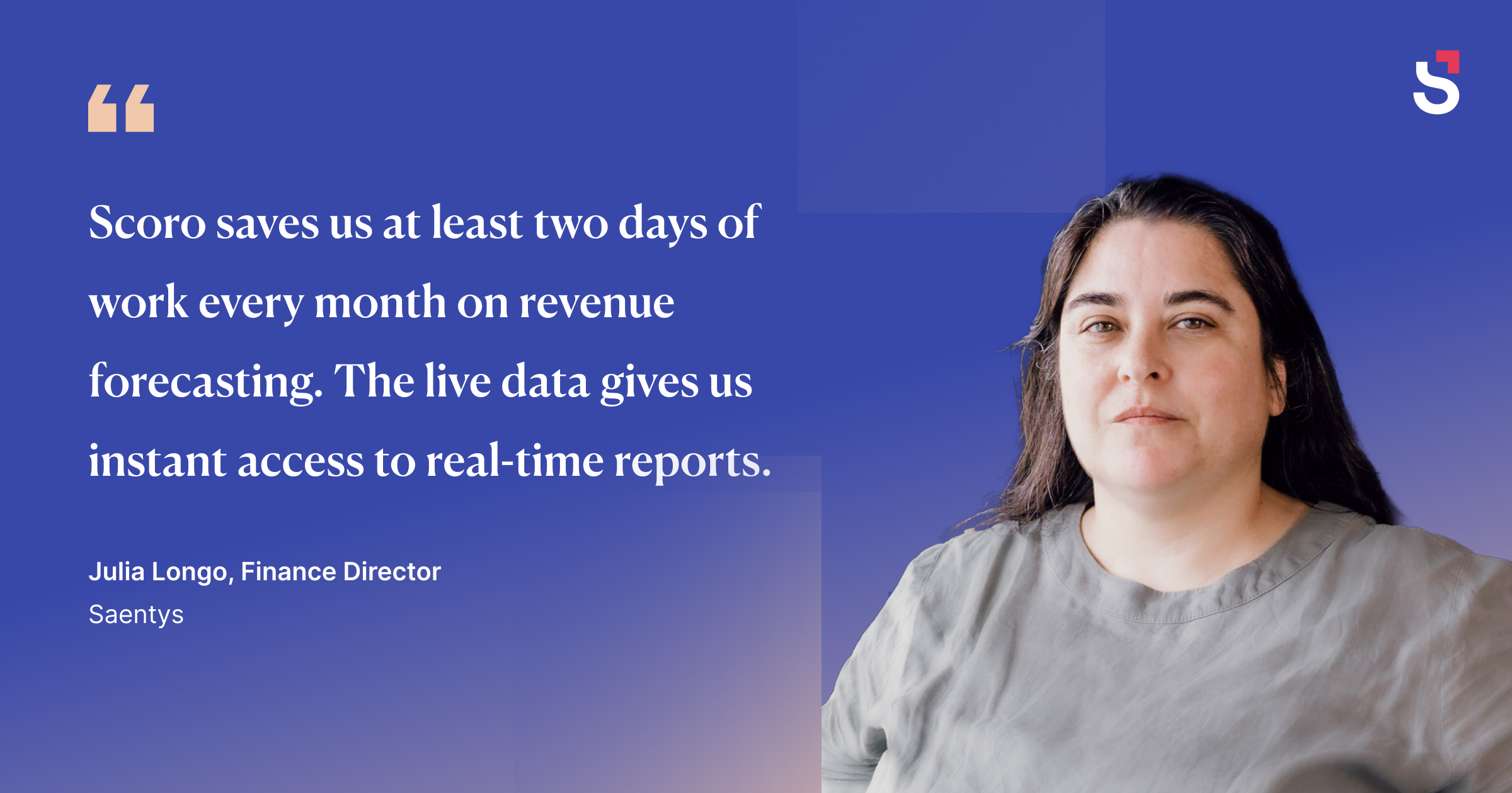
Saentys, a multi-entity design and marketing agency, replaced their manual revenue forecasting system with Scoro’s automated dashboards. This saved their finance team two full days each month and provided accurate, up-to-date data for leadership meetings.
Exectuive dashboard features
Scoro’s customizable executive dashboards are ideal for tracking a selection of your company’s most important data in one place.
Its features include:
- Result metrics: Track key numeric data such as sales figures, profit margins, and sales pipeline to stay on top of company performance
- Customizable widgets: Display essential business data like revenue, expenses, cash flow, and key performance indicators using widgets tailored to your needs
- Interactive Charts: Visualize business data using charts to spot trends and communicate progress to stakeholders effectively
- Multiple Dashboards: Create separate dashboards for different departments, initiatives, or strategic goals to ensure everyone can access the information they need
Editing your dashboard
The CEO/COO is the default dashboard in Scoro. But, if you do want to modify it, follow the steps below.
Configure your dashboard
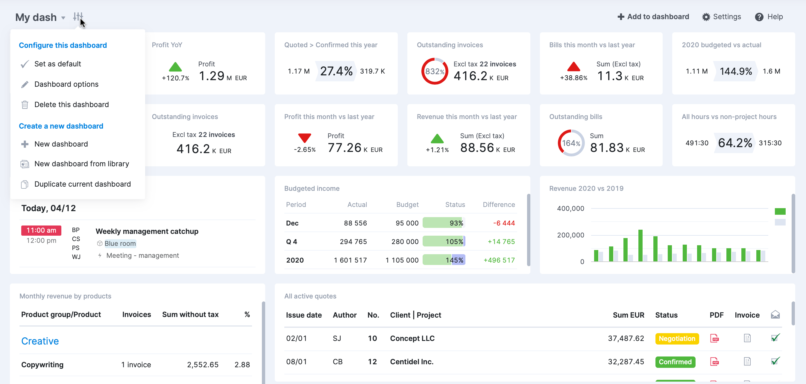
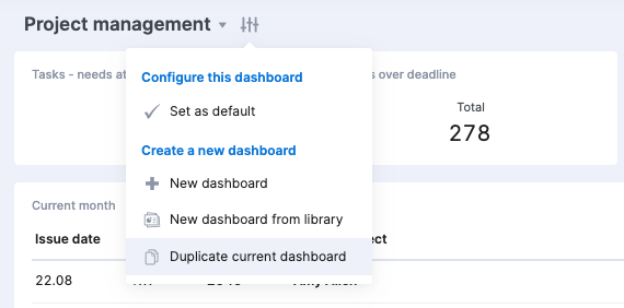
Click the “Configure” button on your existing dashboard. Choose “New dashboard” to create a dashboard from scratch or “New dashboard from library” to select a pre-built template.
Add dashlets
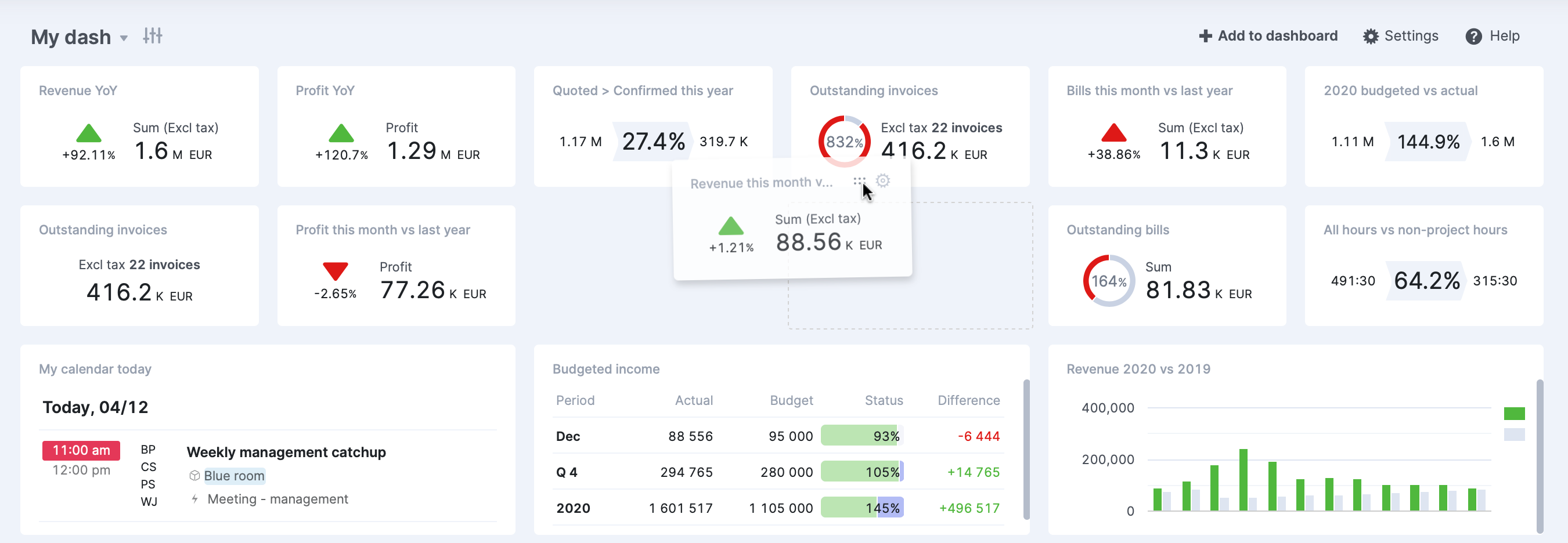
Click the “Add to dashboard” button to add new dashlets. Select from options like result metrics, ratio metrics, or charts. Choose data sources and set filters to display relevant company data.
Drag and drop dashlets to rearrange them on the dashboard, and then resize dashlets by dragging from the lower right corner to create the optimal layout for your needs,
Customize your dashlets
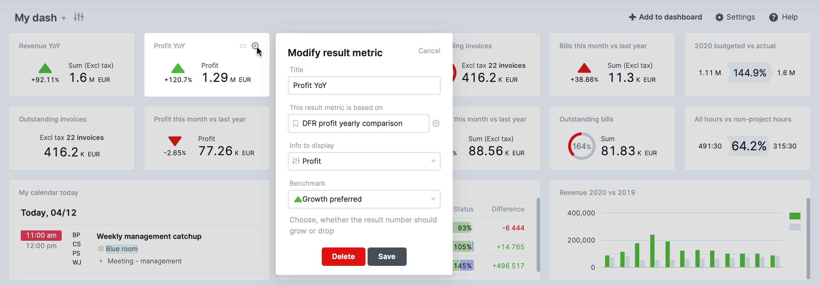
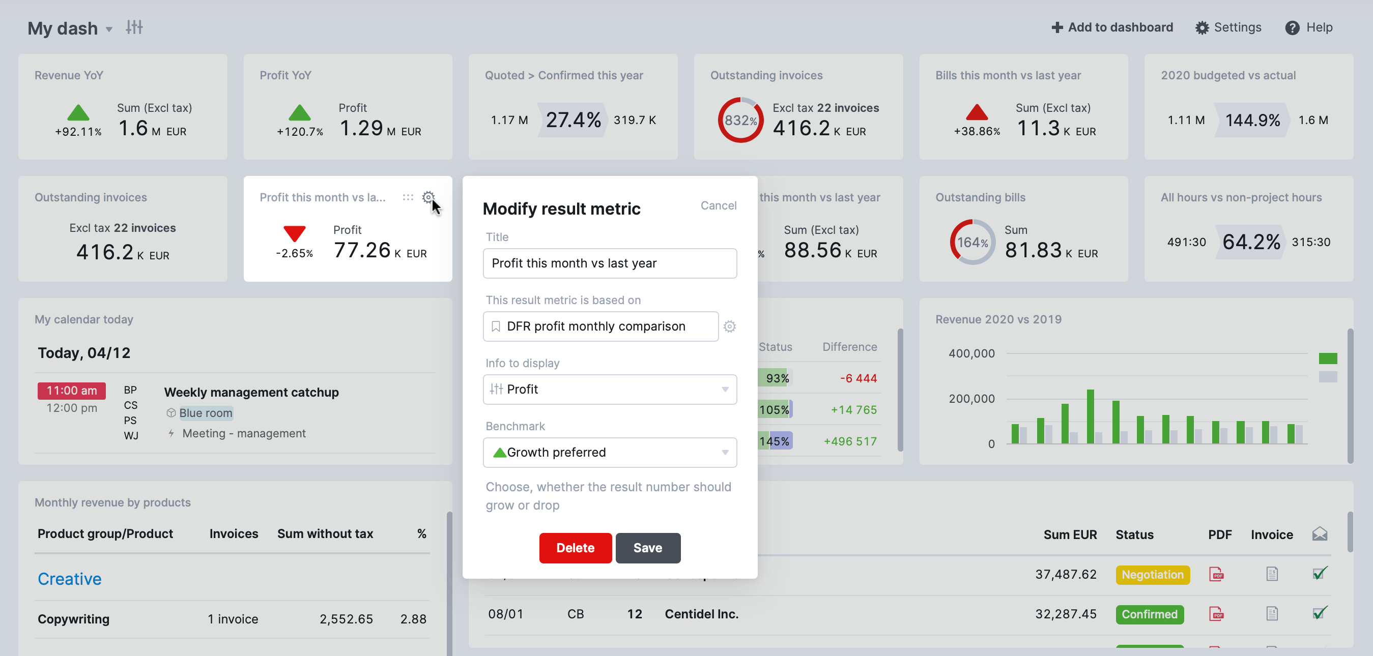
Click the settings icon on each dashlet to customize it. Set filters to focus on specific financial data, projects, tasks, or team members. Choose the information to display, such as revenue YoY, outstanding invoices or deals closing this month.
Creating a new CEO dashboard
If you’re starting with a fresh, empty dashboard, the first step is to add some dashlets. Click the “Add to dashboard” button to get started.
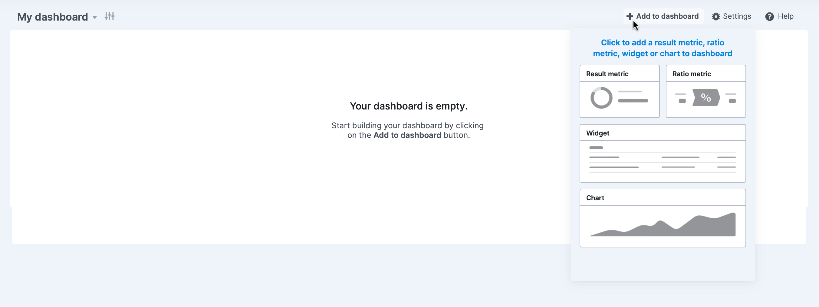
Please note that if the “Add to dashboard” button is not visible, it could be due to one of two reasons:
- You’ve already added the maximum number of dashlets allowed (36)
- Another user owns the dashboard
If you want to add a new metric to a dashboard owned by someone else, you’ll need to create a duplicate of the current dashboard. This way, you’ll own the duplicate dashboard and can add new dashlets to it.
Click the desired option to add a new dashlet, such as “Result metric.”
You’ll be presented with several choices:
- Browse bookmarks library: Select from a collection of pre-made bookmarks
- Choose from a bookmark: Pick an existing bookmark from your Scoro site
- Create a new result metric: Build a custom metric from the ground up

For this example, let’s choose “Create new result metric.”
Select a “source” for your metric (e.g., Invoices) and apply the appropriate “filters” to narrow down the results to the specific data you need.

Click “Next.”
Enter a “title” for your bookmark and specify the “Info to display.”

Crucially, set a “benchmark” for your metric by adding a “goal” or a “limit” and a benchmark value that your result will be measured against. This lets you see at a glance whether you’re achieving your goals or staying within your limits right from your dashboard. Click “Save.”
You can always go back and modify any of the dashlets on your dashboard if needed. Just click on the Settings icon on the dashlet.
Build your own executive dashboard with Scoro
By consolidating key metrics into a single, easy-to-use interface, these dashboards help eliminate manual processes, reduce errors, and save time.
As seen with Trust Impact and Saentys, Scoro’s dashboards don’t just streamline workflows—they also enable teams to focus on growth and deliver better results for their clients.
Are you ready to transform how you manage your business?
Build your own executive dashboard with Scoro and unlock the full potential of your team.


