According to Wellingtone’s State of Project Management Report, 50% of project managers waste at least one day each month manually piecing together status reports.
This manual work isn’t just time-consuming—it’s risky. If you can’t monitor your portfolio in real time, you’ll only catch problems like cost overruns or resource conflicts after they’ve already impacted your projects and profits.
Project management dashboards solve these issues, giving you instant visibility into project progress with clear charts and KPIs.
Here are eight different project dashboard examples in Scoro that help you deliver profitable projects on time and within budget:
1. Project manager and tracking dashboard
A PM dashboard should be the first one you open in the morning, giving you a high-level overview of the real-time health of your projects. Quickly spot costly red flags (like overdue work or overservicing) and prioritize addressing them.
And since you’re not chasing down status updates, you have more time to focus on what matters: guiding teams, meeting your business goals, and delivering results clients love.
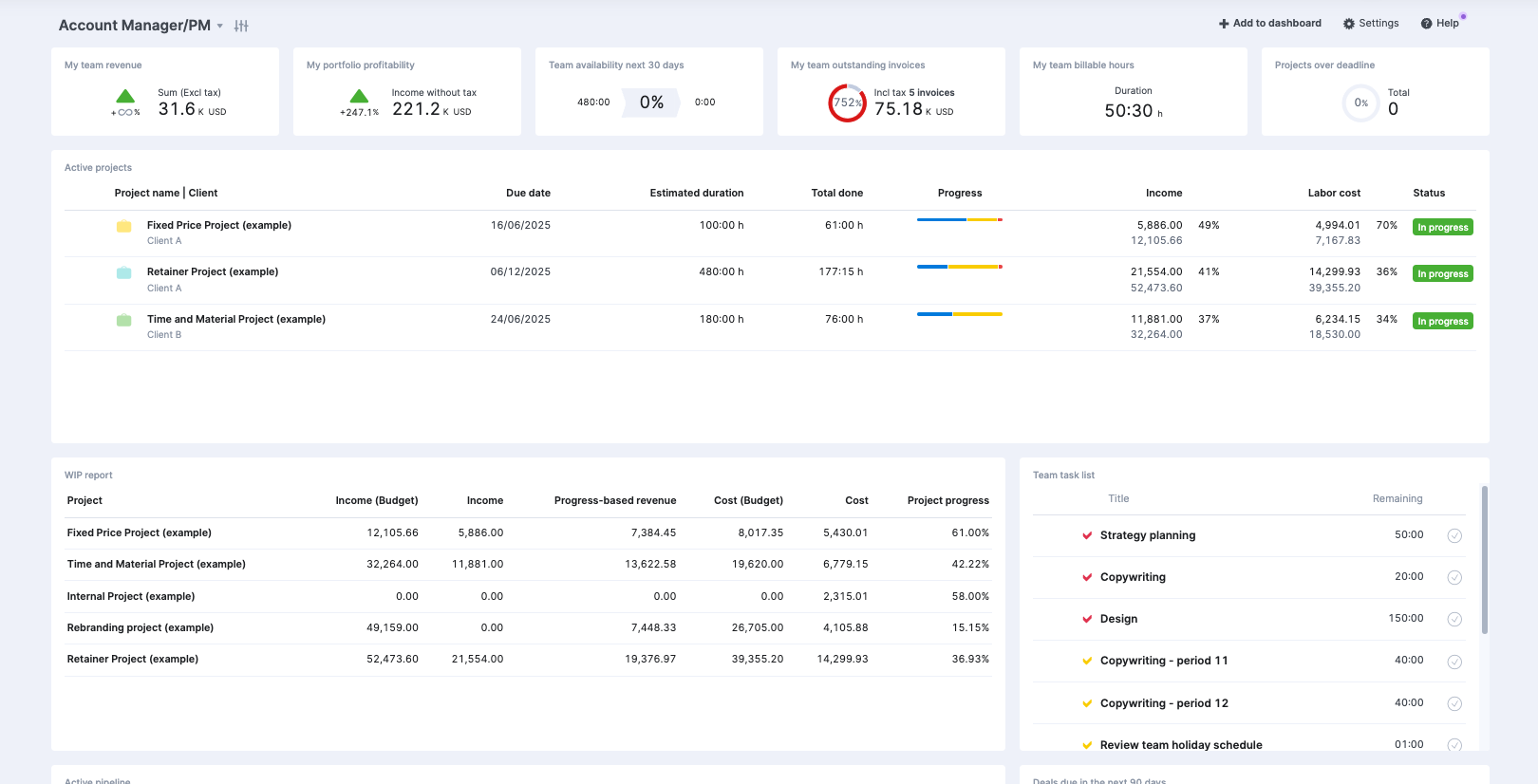
Add in your most important metrics and charts to see the big-picture view of how things are going, keeping a close eye on everything from finances to timelines.
For instance, in the screenshot above, this PM chose to include:
- Team revenue: Tracking whether earnings are trending up or down
- Portfolio profitability: Measuring net earnings after taxes and costs
- Team availability: Monitoring what percentage of each team member’s capacity is allocated across the upcoming month
- Outstanding invoices: Viewing clients’ overdue payments immediately
- Billable hours: Tracking revenue-generating work hours separate from non-billable time (like admin tasks)
- Projects over deadline: Identifying delayed projects needing attention
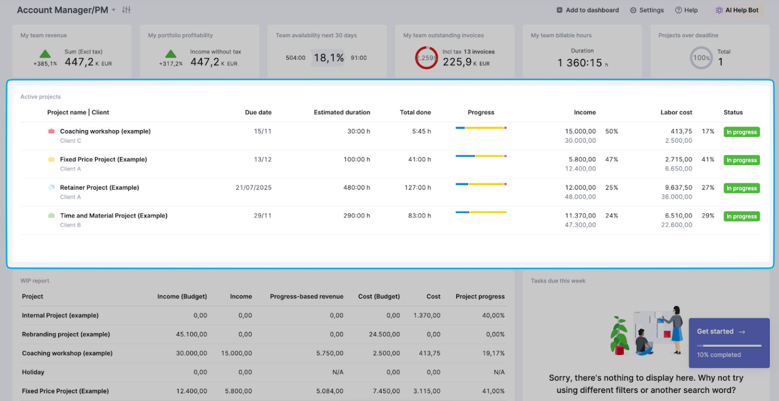
There’s also the “Active Projects” section, highlighting key details like due dates, planned hours versus logged hours, income, and labor costs for current projects:
And the “Work in Progress (WIP) report” widget lets you monitor finances in real time, comparing budgeted amounts against actual costs and income:
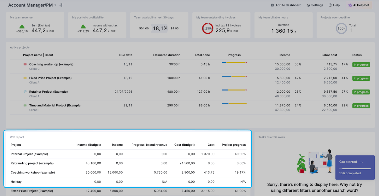
Here, you can spot potential financial issues while there’s still time to course-correct. For example, if you notice a project has used 75% of its budget but is only 50% complete, you’ll know you need to jump in to get things back on track.
2. Project portfolio dashboard
While a PM dashboard gives you high-level health metrics of active projects, a project portfolio dashboard lets you explore all projects—whether they’re active, completed, or in the planning stages.
Think of it as your project microscope rather than your project telescope.
While a telescope gives you a broad view from afar, a microscope lets you zoom in to examine the fine details—similarly, this dashboard lets you probe into the specifics of each project rather than just seeing the big picture.
With all your project info consolidated in a single, organized view, you can easily compare projects to see what’s working (and where you need to improve).
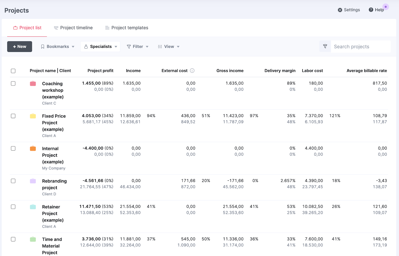
Add and review customizable columns like:
- The assigned project manager
- Due dates
- The project progress bar
- Income amounts
- Labor costs
- Project profit calculations
- Average billable rates
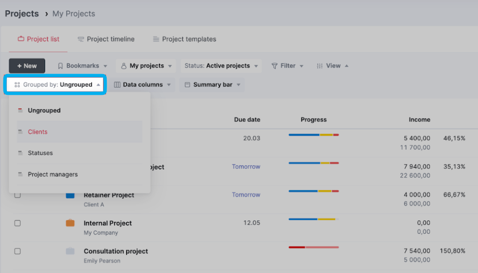
Then, refine the data further with the “Grouped by” and “Filter” features.
The ‘Grouped by‘ option lets you cluster related projects together. You can group by:
- Client
- Status
- Project manager
And the ‘Filter‘ feature helps you identify patterns and trends across your portfolio, surfacing specific projects based on:
- Date ranges (to spot seasonal patterns or analyze performance over time)
- Project types to compare performance across different kinds of work or spot patterns among similar projects)
- Tags (to analyze performance of specific initiatives or campaigns)
- Project statuses (to study historical performance or focus on current work)

For example, by filtering to only show completed design projects from the last quarter, you might notice they consistently ran over budget in the research phase.
Or by filtering to show all active projects tagged as “high-priority,” you can spot if delays in one project are creating a domino effect on others—like when Project A’s extended research phase means your senior designer can’t start on Project B’s deliverables as planned.
3. Project pipeline dashboard
Think about the last time your delivery team was overwhelmed because they didn’t see a wave of new projects coming—this dashboard ensures that never happens again.
A pipeline dashboard gives you early insight into potential upcoming work. So, you have time for capacity planning before deals close. And aren’t scrambling to find coverage.
This shared visibility into the work queue also reduces friction between sales and delivery teams. Since everyone is working from the same info on project needs and team bandwidth, there’s no risk of sales making promises that delivery can’t actually keep (like unrealistic deadlines). And you can address any potential problems before the contract is signed.
For example, if sales has added a large website redesign for Q2 to the queue, you can start proactively planning and see if you need to adjust other project timelines or bring in additional resources to make it work.
Or if a potential project requires specialized skills, you can confirm whether you have the in-house capabilities or need to outsource.
Scoro’s “Pipeline” dashboard organizes opportunities into stages (Opportunity, Scoping, Proposal, and Confirmed) and lets you customize what critical information to display on each card, such as:
- Estimated start and end dates
- Required team skills and availability Expected hours
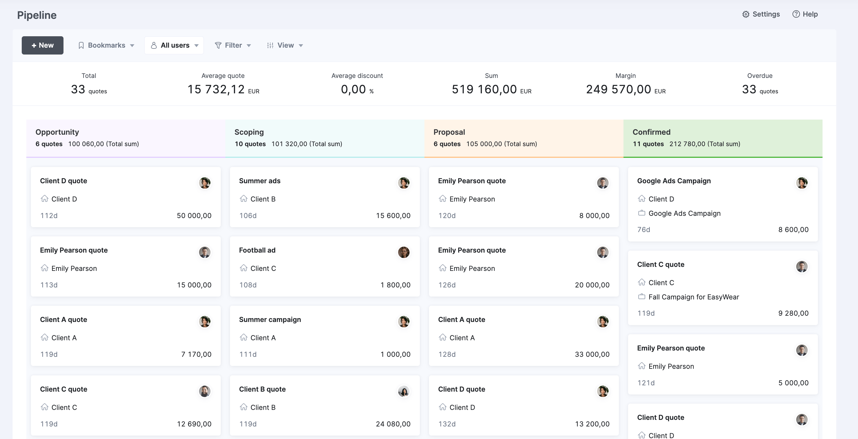
And at the top, real-time summary metrics show the total pipeline value, number of opportunities, and delivery capacity. These ensure you balance your pipeline effectively—preventing both overcommitted teams and costly underutilization where you have available resources but no incoming work.

4. Project utilization dashboard
Keeping your team’s workload balanced is key for project success.
When team members go beyond a 70% to 80% billable utilization range, they’re headed for burnout—and you risk delays and low-quality deliverables. But a lower percentage means missed opportunities to pursue revenue-generating work.
A utilization dashboard helps you assign work in ways that keep team members in the ideal zone, offering a clear visual snapshot of their availability and utilization rates.
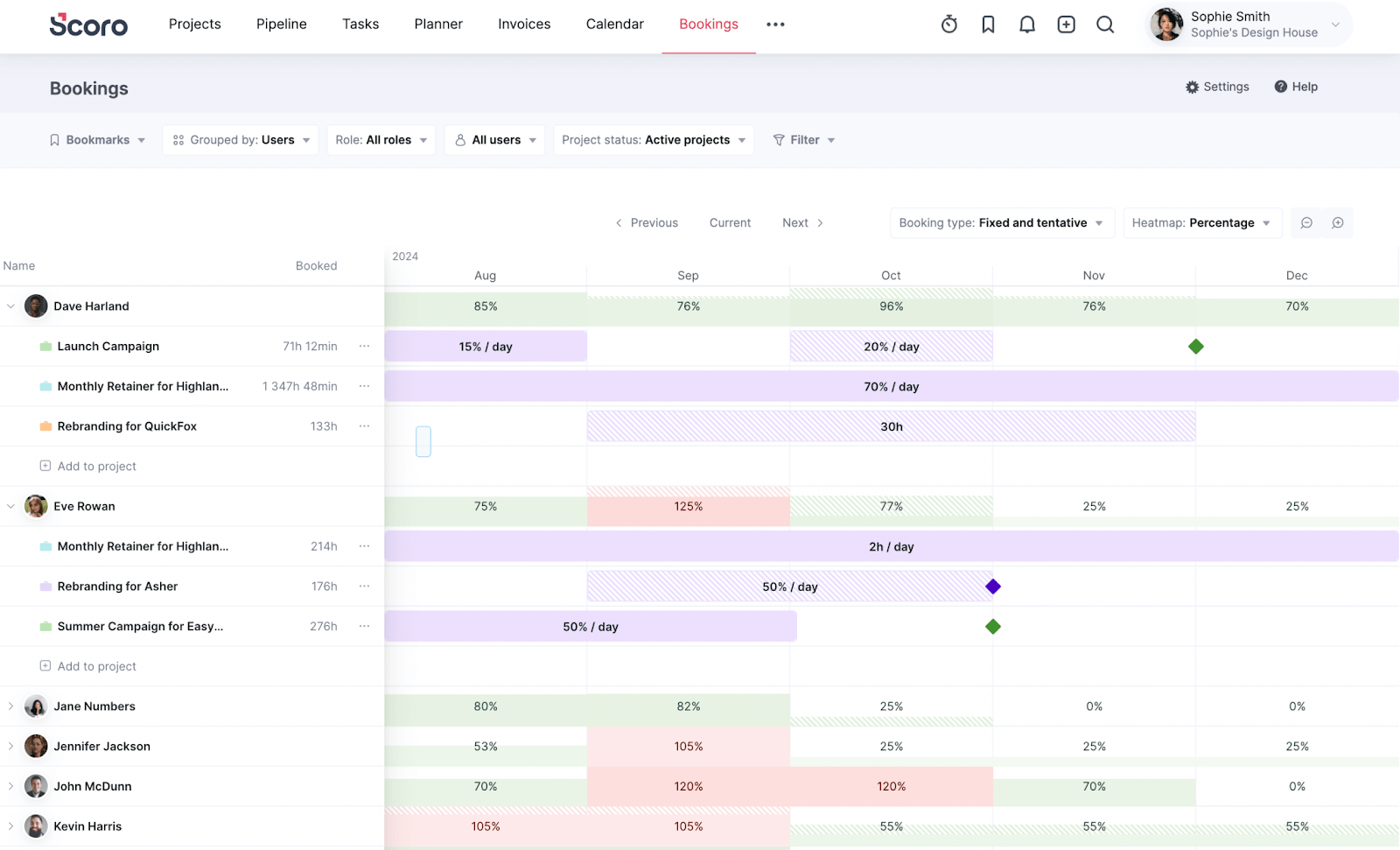
Scoro’s Bookings dashboard lets you group team members by roles, using a color-coded heatmap to show everyone’s different capacity levels:
- Green for remaining available capacity
- Red for overbooked
And each block’s style indicates the work type—solid for confirmed work, striped for tentative bookings, and special corner markers for time off or extra availability.
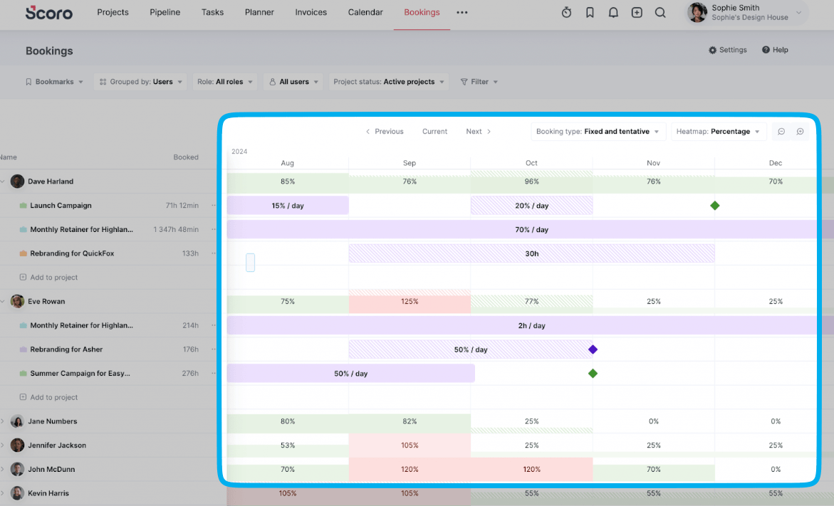
This visual, drag-and-drop system simplifies resource management, letting you easily assign and redistribute tasks across your team.
For instance, if you notice one designer is at 95% utilization while another is at 60%, just shift some design tasks to bring both closer to the ideal 70-80% utilization rate.
This dashboard keeps your team working at an optimal capacity—avoiding stressful overutilization while still making sure they have enough revenue-generating tasks on their plates.
5. Project timeline dashboard
Manually managing multiple projects can make tracking deadlines and dependencies overwhelming.
By bringing all your projects into a single, visual graph, a project timeline dashboard makes it way easier to stay on top of your entire portfolio.
Monitor project progress, spot overlapping deadlines, and quickly identify (and address) roadblocks that can derail deliverables.

Scoro’s “Project timeline” view gives you a clear snapshot of where every project stands using different colored markers:
- Blue: Work completed—you’re on track.
- Yellow: Work in progress—keep an eye on it.
- Grey: Specific tasks in progress—check in if needed to address roadblocks.
- Red: Overscheduled work—act now to address issues.
- Orange diamonds: Milestones—celebrate when you hit them!
If you need more specific info, click the grey icon next to any project name to expand its phases and milestones.
For instance, if you notice a project’s timeline bar turning red, you can click to expand it and see exactly which tasks are causing delays. You might discover that three design review tasks are overdue because they’re waiting on client feedback.
This detailed view helps you take targeted action—like following up with the client or adjusting downstream deadlines—before delays spill into other project phases.
6. Project profitability dashboard
A project profitability dashboard shows you which projects, clients, and teams are making (or losing) the most money for your company.
It helps you see beyond top-line revenue to understand your true earnings, factoring in costs to determine how much you’re actually making.
Without tracking profitability, it’s easy to fall into a trap of just pursuing high-revenue projects while overlooking types of work that offer better margins.
For example, a project that brought in $50,000 sounds great—until you realize high labor costs ate up your profits.
In Scoro’s Project list, three project management KPIs at the top give a snapshot of financial performance, so you can quickly identify areas to investigate or optimize:
- Total actual profit: Earnings after all expenses
- Profit percentage: Team efficiency in delivering work
- Budgeted profit: Planned versus actual earnings
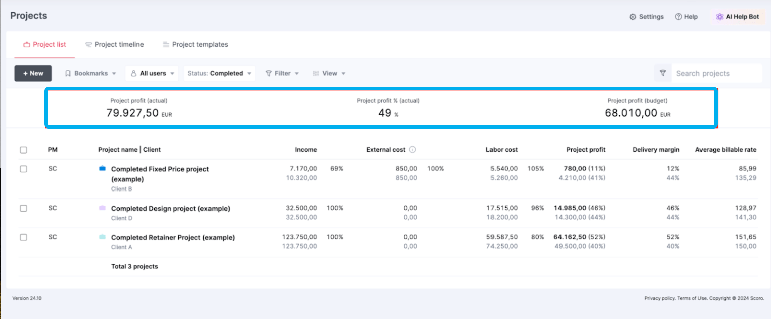
Filter by project types, clients, or project manager. Then, dig deeper with customizable columns for project-specific metrics, including:
- Income (budgeted and actual)
- External costs
- Labor costs
- Project profit (both amount and percentage)
- Delivery margin
- Average billable rate
Tracking these kinds of metrics helps you answer key questions that impact your bottom line:
- Which project types deliver the best return on investment?
- Are high-revenue clients actually truly profitable after factoring in costs?
- Are certain project types or clients costing us too much money?
- Do we need to reduce labor costs or expenses?
For example, you might discover that while Client A brings in more revenue, Client B’s projects consistently deliver better margins due to faster turnaround times on revisions. Which reduces labor costs.
With this insight, you could improve Client A’s profitability by implementing stricter revision limits in future contracts, scheduling more detailed kickoff meetings to align with expectations, or adjusting your rates to account for the extended feedback cycles.
7. Project budget dashboard
Ever start a project with a healthy budget but end up burning through most of it before you’re at the finish line?
A budget dashboard helps you get ahead of these cost overruns, tracking spending in real time so you can project your margins.
In Scoro’s case, the budget dashboard is split into two key charts: “Budget burn” and “Budget breakdown.”
These two views give you complete control over your project finances. The burn chart shows your overall budget health and trajectory, while the breakdown chart reveals exactly where your money is going by role or service.
The burn chart tracks the rate at which you’re using your budget. The teal lines represent your total budget (what the client pays), while the purple lines show your company’s costs (what you spend).

The gap between them? That’s your profit potential—in this example, that would be around $12,000 ($31,000–$19,000). Hover over any point on the lines to see more financial details for that day.
And below the graph, five key metrics help you further gauge your financial health:
- Used budget: How much of the client’s budget you’ve used so far
- Forecasted budget: What the final number will likely be
- Actual costs: What you’ve spent delivering the work so far
- Forecasted costs: What you’ll likely spend to finish
- Profit margin: The percentage you’ll make after costs
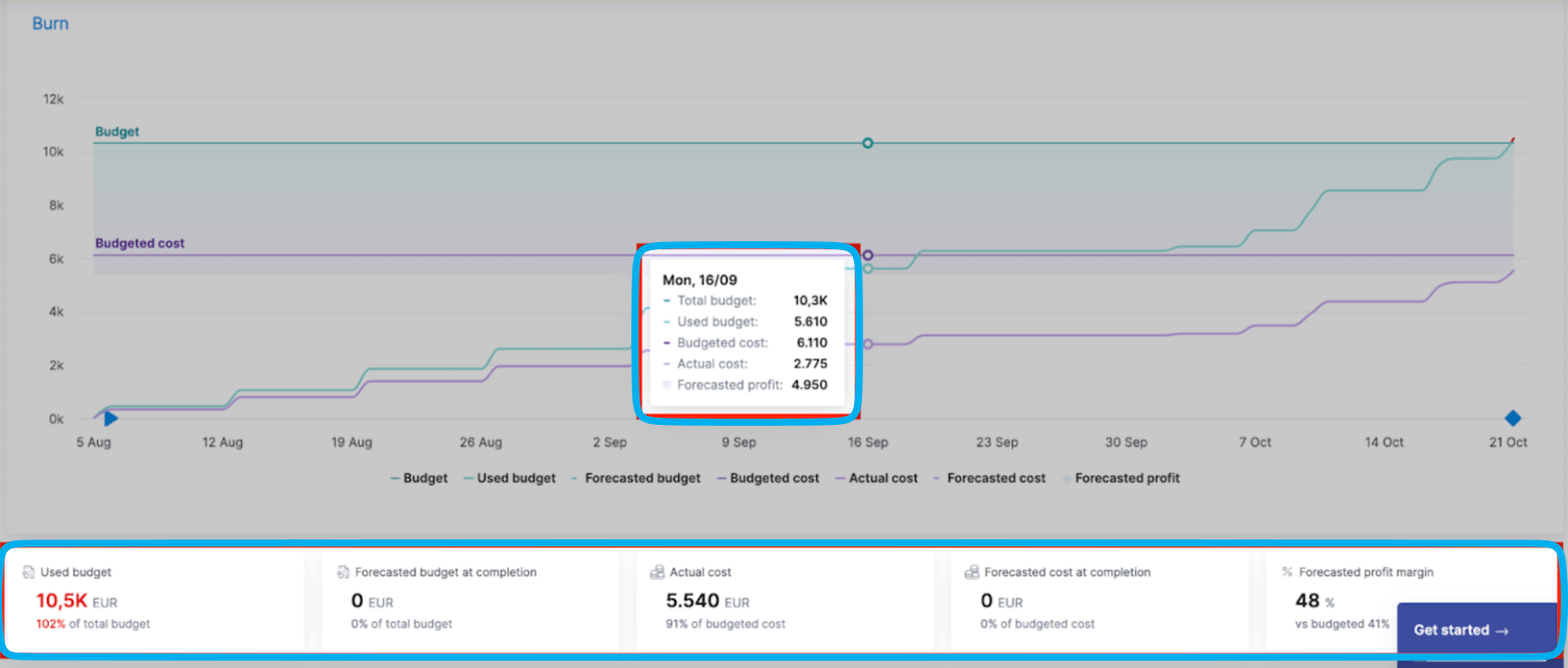
For instance, if you see you’ve used 60% of the budget but your forecasted costs show you’ll need 90% of the budget to complete the work, you can act immediately. Whether that’s having a scope discussion with the client, adjusting team assignments, or finding other ways to control costs before your profit margin shrinks.
Then there’s the breakdown chart, which categorizes costs based on different roles or services. So, you can clearly determine how certain types of work impact the overall budget.
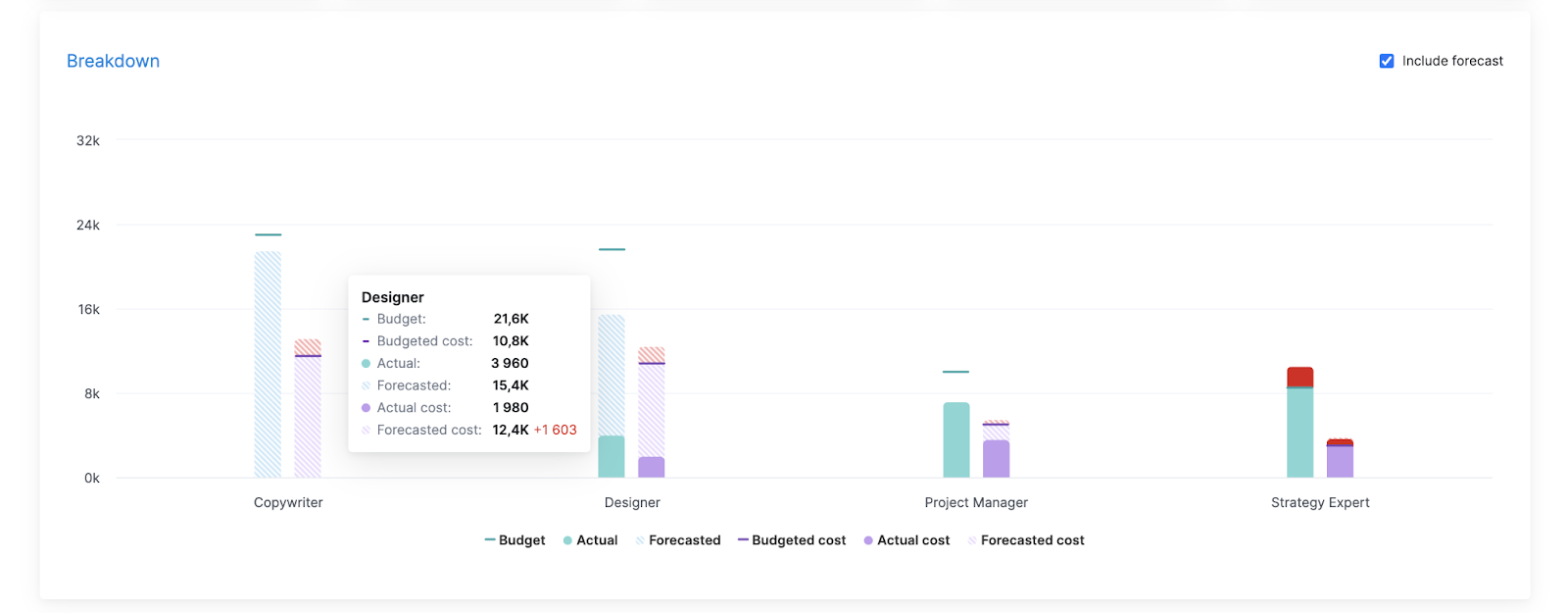
There are two bars—the teal bar represents the total budget while the purple bar is the budgeted cost. Each bar uses:
- Solid colors for completed work
- Striped sections for planned work
- Lines marking budget limits
Say you see that spending for design is predicted to go way over budget, while copywriting is still within your planned range. You check in with your design team and find that client feedback rounds are taking twice as long as planned—and eating into your profits.
So, you can get back on financial track by:
- Talking to the client about either reducing the number of feedback rounds or
- Implementing additional charges when reviews extend beyond the originally agreed-upon turnaround times
- Getting client approval to increase the budget to cover the additional design time
8. Budgeted vs. actual dashboard
A budget vs. actual dashboard compares your planned numbers against real-time data for each project phase and service.
It’s an early warning system that serves two key purposes.
In the short term, checking your estimates against current figures helps you steer things back on course if, say, work starts going over budget or scope creep slows project progress down.
And in the long term, analyzing the patterns between your estimates and actual numbers helps you quote future work more accurately—like realizing certain project phases consistently need more hours than you’ve been allocating.
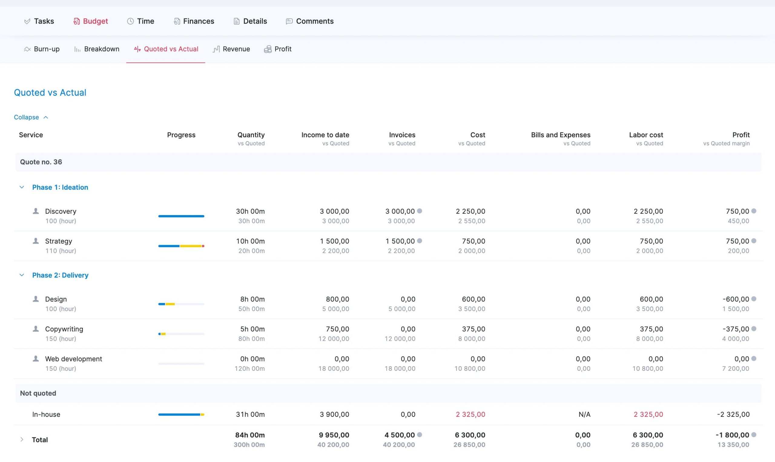
The chart is broken down by phases and services, giving you a clear overview of key metrics at every project stage. In each column, the current figure is in black and the original estimates are below in gray:
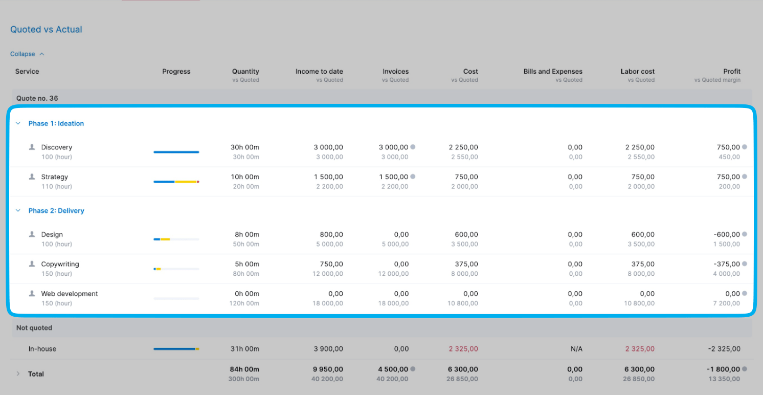
And at the bottom, the “Not quoted” section highlights unplanned work that threatens your profits—like 31 extra hours costing $2,325.

Use the dashboard:
- Before weekly client meetings to spot potential overruns
- During each project phase to make sure you’re billing appropriately
- When deciding if you can take on out-of-scope client requests
- During monthly financial reviews to improve the accuracy of future project quotes and resource estimates
For example, let’s look at “Phase 1: Ideation”:
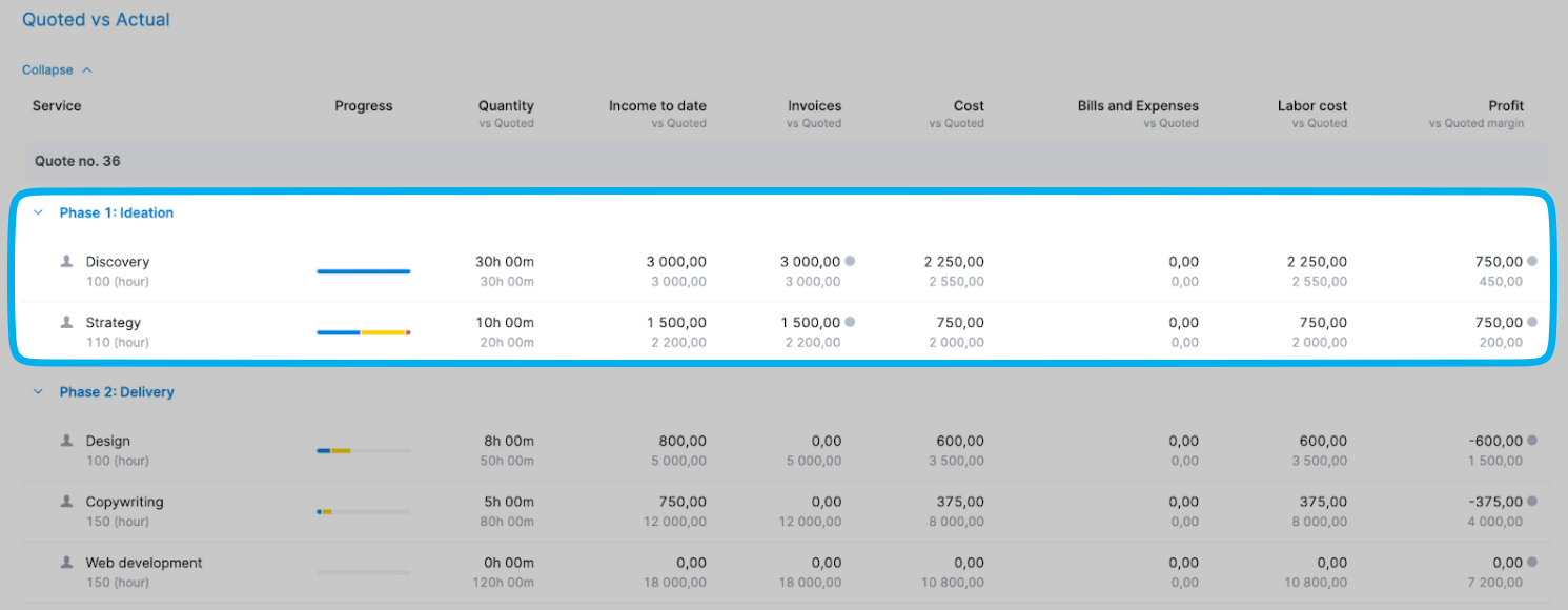
Discovery is on target—30 hours used and $3,000 earned as planned. But Strategy is over budget—10 hours used (half of the planned 20) and 75% of the budget spent.
This signals an immediate need to investigate why Strategy tasks are taking longer than estimated. You might need to meet with the strategy team to understand if they’re facing unexpected challenges, adjust the remaining Strategy tasks to stay within budget, or have a scope discussion with the client if additional complexity is driving the overages.
Get faster business insights with Scoro’s project management dashboards
Manual data management and reporting take time away from actually managing projects.
With Scoro’s comprehensive dashboards, you get instant access to key, real-time data. So, you can easily make informed choices that support your projects and profits—all in less time.
Just look at agency Saentys. After switching from spreadsheets to Scoro’s live dashboards, the company reclaimed at least two days a month that used to be spent on manual reporting.
Try Scoro’s dashboards for free today to see how greater project visibility can boost your team’s success.


